Accessibility can be easy
Unless you work for a few tech companies people at your workplace probably don’t spend as much time thinking about accessibility. I don’t mean having a UX team that simplifies a journey but catering to users with needs such as having to access the built-in narrator on Apple, Android or Windows desktop and mobile operating systems. It’s important to pay attention to your home, landing pages and everywhere someone might go on their journey to buying your product.
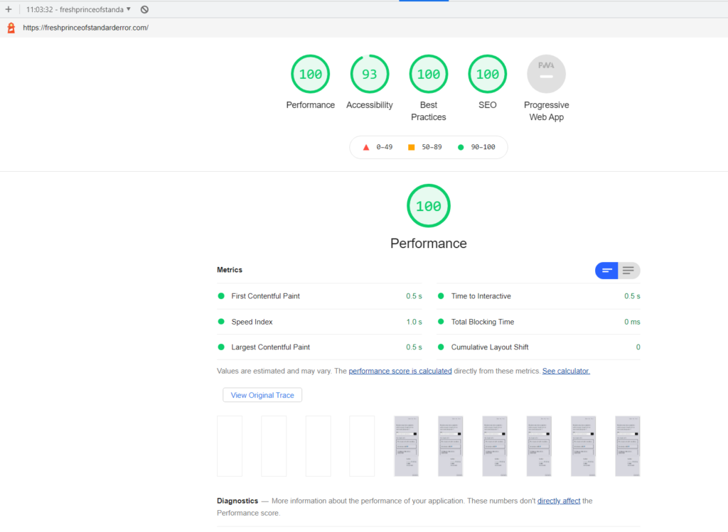
Shock upon seeing my web accessibility score (kidding mine was 93)
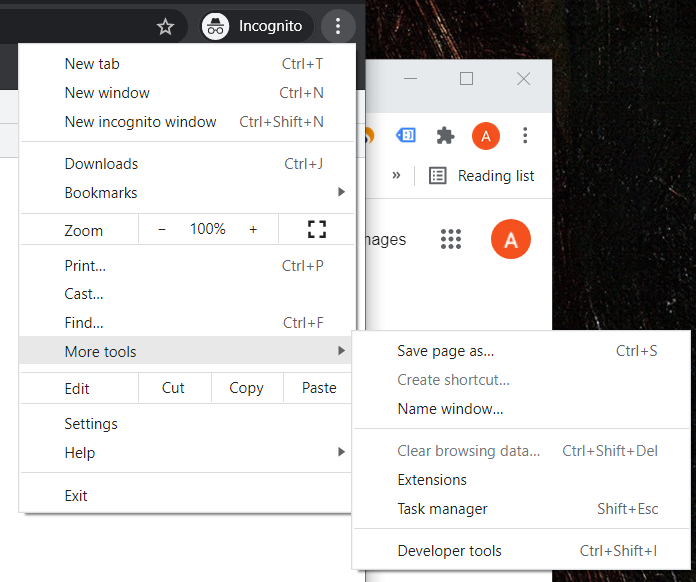
You can check your score somewhat easily if you use Chrome. Go to developer tools by using the three vertical dots / options panel.

I used incognito mode because I was logged into my CMS and I’m not a 100% certain whether it makes a difference. If you aren’t logged in then, you might not need incognito. The browser cache is purged when you do the lighthouse test.

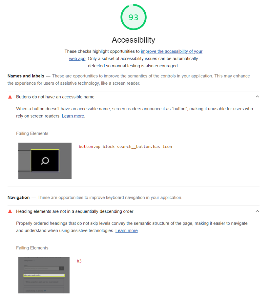
Upon clicking submit it will generate a report, which for me was unsatisfactory on accessibility (93) because I try to put some effort into accommodating everybody even if it is a personal blog.

Some quick tips to help accessibility ??
- Make sure all your images have an alternative text. On your CMS you can set one up easily. If it is descriptive and accurate than along with helping your fellow user you also improve SEO
- The buttons have an accessible name or description if you use an icon
- Try to follow (and I’m guilty of this) a good page structure where H1 H2 and H3 follow one another properly. Ideally you do not want more than one H1. Create a hierarchy of headings first before adding content if you struggle with consistency.
- UX people are actually good at this, but try to use icons that describe the text at lest in navigation when you can.
- Tooltips are actually accessibility friendly and some accessibility readers can narrate it automagically.
- Finally, FOLLOW WHATEVER LIGHTHOUSE TELLS YOU IN ACCESSIBILITY

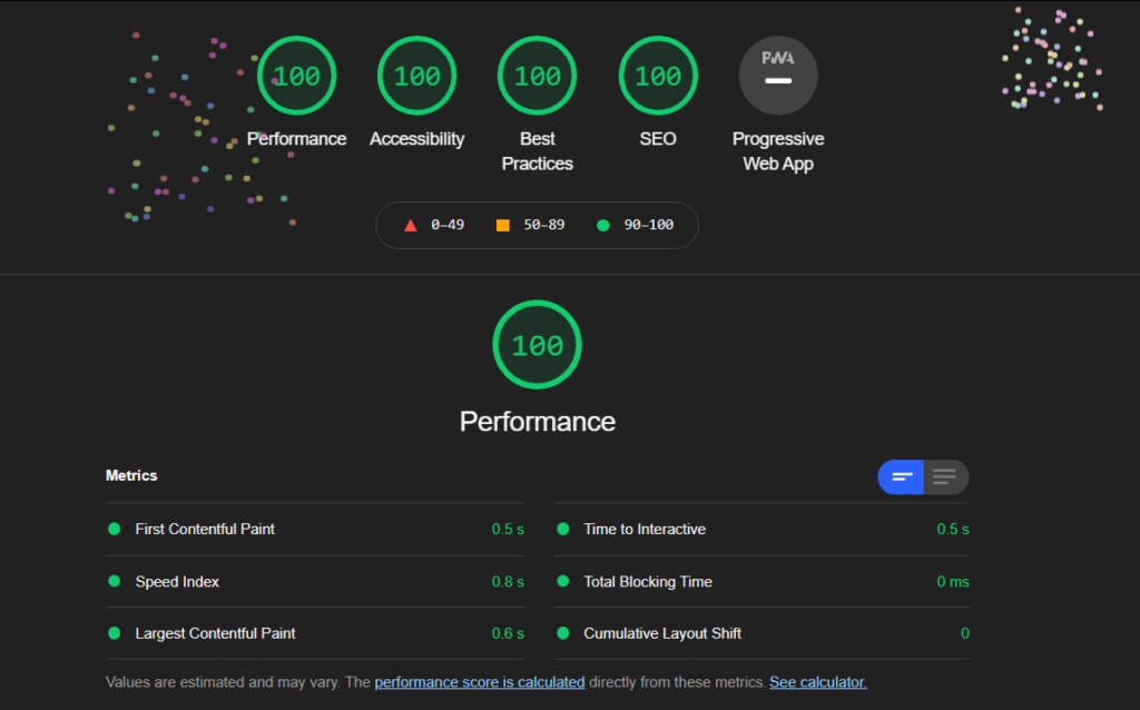
I had already followed my tips out of habit, but after following the tips I got from Lighthouse I improved my page’s accessibility score on their test. I had to change a couple of things the most major of which was the search button.


They actually give you a nice confetti message for getting a score of 100 in everything

