
WhY DoEs ThE SaMe line fit all these datasets?
Hey,
If you are ‘data-driven’ then decision-making can seem deceptively easy. Ever compared a bunch of descriptive stats between datasets? Like mean, standard deviation, correlation? It is easy to look at a table of such numbers and carry on with your day.
Sadly, using popular stats and linear regression is a common noob trap, one that Anscombe’s quartet has highlighted in the past. We will learn about Anscombe soon.
When decisions need to be made that have a big impact, like analyzing different products, promoting an employee, or judging the performance of different assets before allocating billions of dollarydoos, it becomes important to not fall into noob traps.
I always thought this was not worth writing about, but I have seen all sorts of misguided attempts to use data as of late.
To follow along, you only need a basic grasp of statistics. If you want to run the analysis yourself, then you need a Python environment.
Loading the dataset
We can examine this comprehensive dataset from the people at Autodesk, the makers of AutoCAD. https://github.com/awalpremi/anscombe/blob/main/DD.csv
The dataset contains 13 distinct subsets. Load up your notebook; we need pandas and eventually Scipy.
import pandas as pd
from scipy.stats import linregress
# Load the data
df = pd.read_csv("https://github.com/awalpremi/anscombe/blob/main/DD.csv?raw=true")
df.head()
Each subset has X and Y which consist of 142 x and y pairs. It’s a tall and tidy dataset.
## Group data by 'dataset' column, maintaining the order of appearance
datasets = {label: group[['x', 'y']] for label, group in df.groupby('dataset', sort=False)}

## The different datasets
print('Unique datasets:', df['dataset'].nunique())
for i, (label, dataset) in enumerate(datasets.items(), start=1):
    print(f"{i}: {label}")
A table for decision making
A lot of analysis that is passed on in reports consists of the following:
- Mean
- Variance
- Correlation
- Regression line and R2
Making such a table is easy, feel free to add your own stat in there too.
# Create an empty list to store the statistics
stats_data = []

# Iterate over each dataset
for i, (label, dataset) in enumerate(datasets.items(), start=1):
    # Compute the statistics
    mean = dataset.mean().to_dict()
    variance = dataset.var().to_dict()
    correlation = dataset.corr().iloc[0, 1]
    slope, intercept, r_value, _, _ = linregress(dataset['x'], dataset['y'])
    r_squared = r_value**2  # Calculate R^2
    covariance = dataset.cov().iloc[0, 1]  # Get covariance between x and y

    # Append the statistics to the list
    stats_data.append({
        'Dataset': label,
        'Mean X': mean['x'],
        'Mean Y': mean['y'],
        'Variance X': variance['x'],
        'Variance Y': variance['y'],
        'Covariance XY': covariance,
        'Correlation': correlation,
        'Intercept': intercept,
        'Slope': slope,
        'R^2': r_squared,

    })

# Convert list to DataFrame
stats_df = pd.DataFrame(stats_data)

# Print the DataFrame
display(stats_df.style.background_gradient(cmap='viridis', axis=1))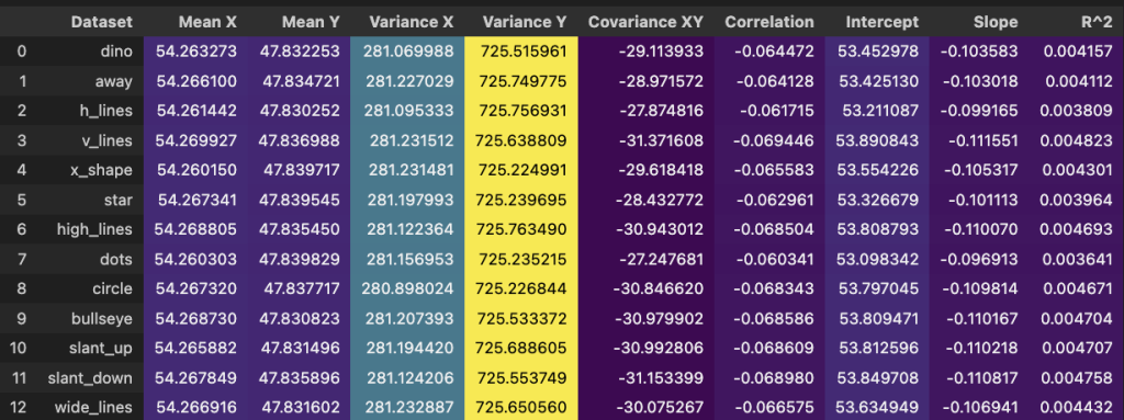
All of them look similar if not the same. Now image a busy person that has to pick an athlete, product, employee or asset out of the 13. It appears they can randomly choose because all the ‘stats’ are identical.
Looking at charts
Visualize the first subset called dino because you picked it randomly.
datasets['dino'].plot(kind='scatter', x='x', y='y')
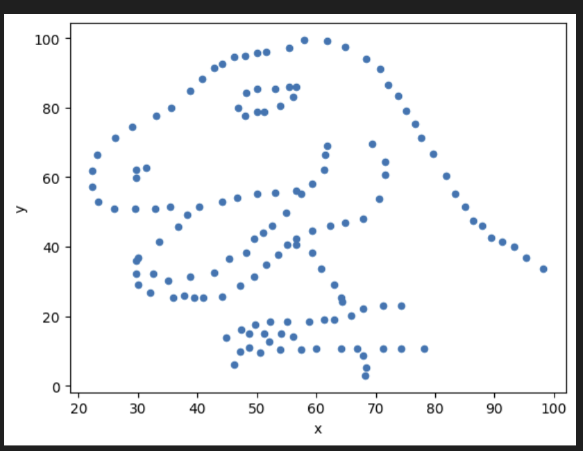
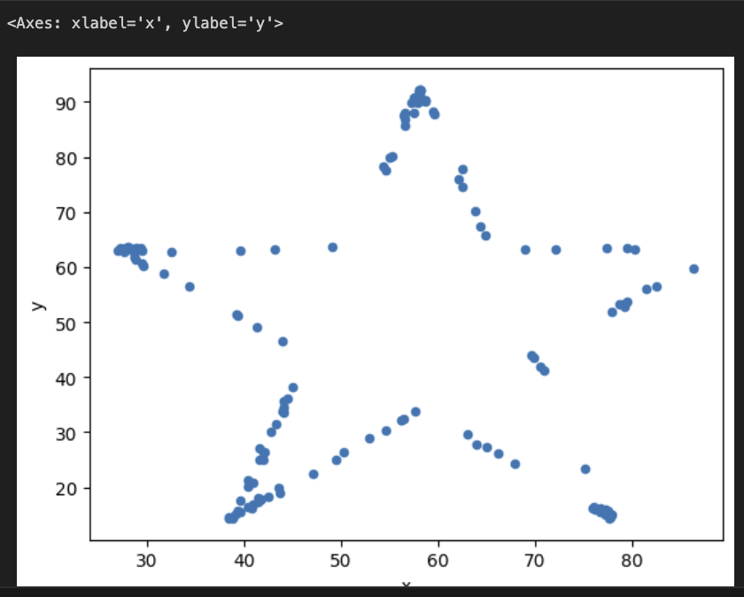
It is… a dino. which other subsets had interesting names? Maybe ‘star’?
datasets['star'].plot(kind='scatter', x='x', y='y')
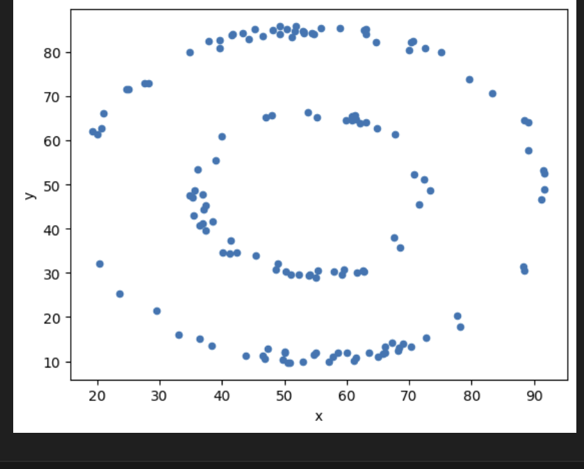
What about… ‘bullseye’?
datasets['bullseye'].plot(kind='scatter', x='x', y='y')
Uhh
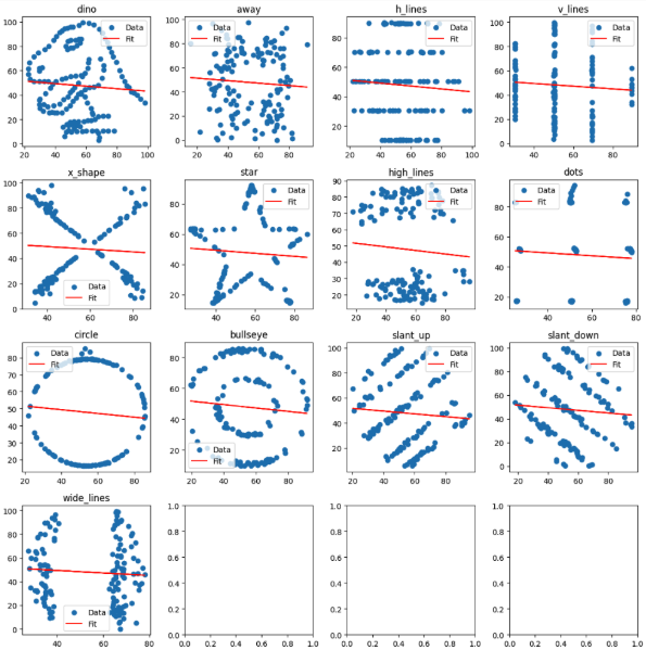
Just do the entire lot.
import matplotlib.pyplot as plt

fig, axs = plt.subplots(4, 4, figsize=(12, 12))  # Adjust the subplot grid as needed
axs = axs.flatten()  # Flatten the axs array for easier iteration

# Plot data and regression lines
for i, (label, data) in enumerate(datasets.items()):
    axs[i].scatter(data['x'], data['y'], label='Data')
    slope, intercept = linregress(data['x'], data['y'])[:2]
    axs[i].plot(data['x'], intercept + slope * data['x'], 'r-', label='Fit')
    axs[i].set_title(label)
    axs[i].legend()

plt.tight_layout()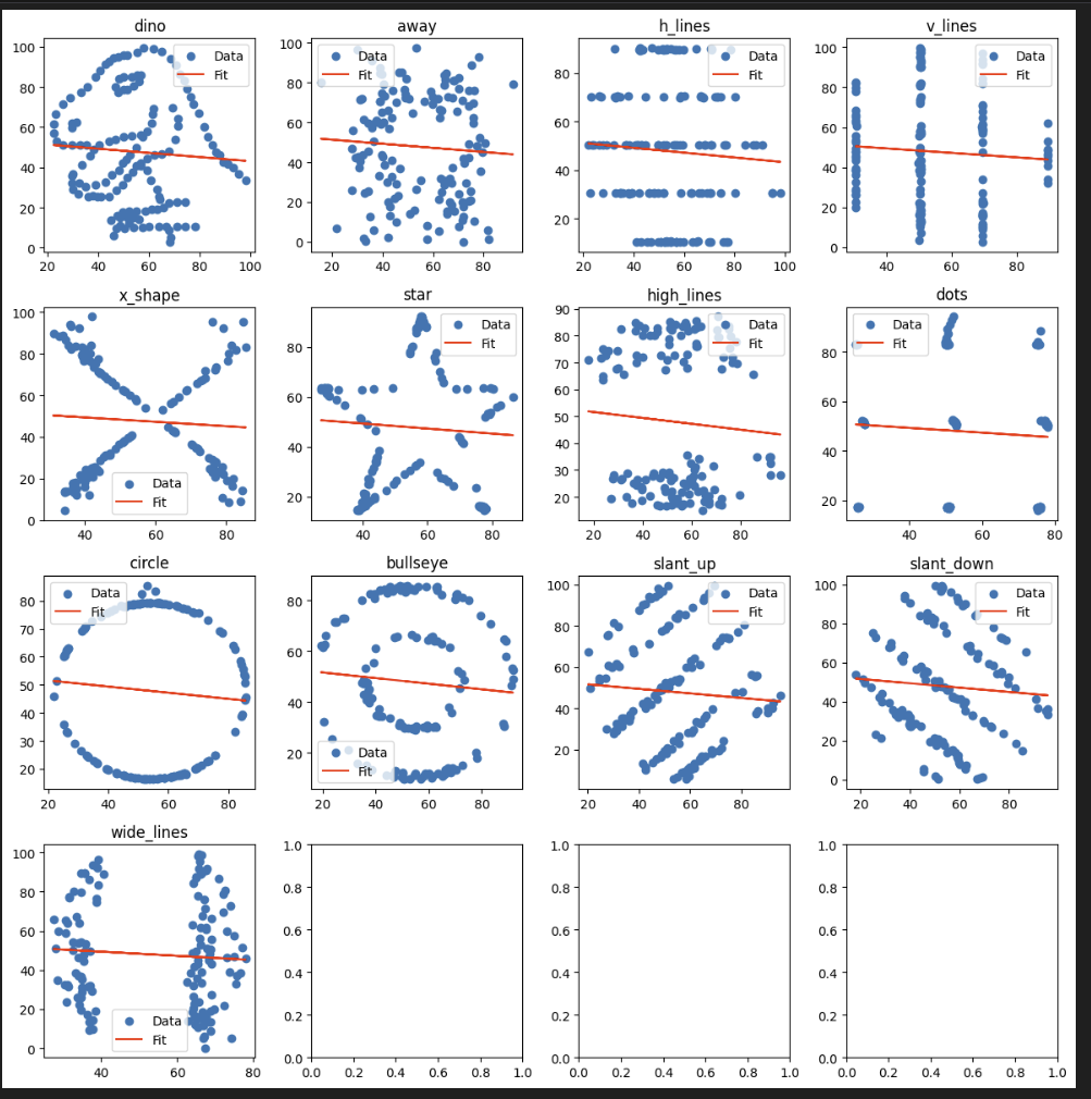
Is there a lesson? Did Autodesk just clown you?
Yes, don’t use ‘stats’ to compare different distributions and use ‘statistical models’ without understanding the underlying assumptions. For example, linear regression comes with a set of assumptions, such as homoscedasticity, independence of errors, a normal distribution of errors, and the absence of multicollinearity among predictors. You can look up all the assumptions before using a model that seems accessible. It might even be a good thing to find out you were wrong because that is how people learn
Anscombe’s quartet
The dataset we looked at earlier is a variation of this and inspired by the original quartet. Our dude Anscombe constructed four datasets in 1973. They have the same values for mean, variance, correlation, linear regression line and coefficient of determination.
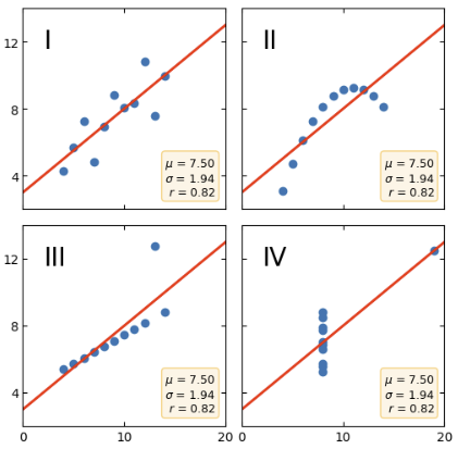
This has been teaching people that numbers, while exact, might be misleading and graphs are rough but can be disillusioning.
While there are only 4 datasets, each of them serve a purpose.
I: Simple linear relationship, so a regression line should work as intended.
II: Not linear therefore forcing a line is misleading.
III: Mostly linear but has one significant outlier, which significantly changes the line making it similar to the others.
VI: Mostly unrelated, would not be correlated, but again the outlier gives the impression there is a relationship when looking at numbers.
But I like numbers
Well, if you have more than a superficial grasp of statistics or motivated enough to learn then you can use numbers only.
I think in this instance the easiest thing to add would be spearman correlation along with pearson because it’s non-parametric and you don’t need normal data for it to be as useful.
While we’re add it lets add higher moments like skewness (long tails) and kurtosis (fat tails).
This is the original Anscombe’s Quartet
# Anscombe's Quartet
x = [10, 8, 13, 9, 11, 14, 6, 4, 12, 7, 5]
y1 = [8.04, 6.95, 7.58, 8.81, 8.33, 9.96, 7.24, 4.26, 10.84, 4.82, 5.68]
y2 = [9.14, 8.14, 8.74, 8.77, 9.26, 8.10, 6.13, 3.10, 9.13, 7.26, 4.74]
y3 = [7.46, 6.77, 12.74, 7.11, 7.81, 8.84, 6.08, 5.39, 8.15, 6.42, 5.73]
x4 = [8, 8, 8, 8, 8, 8, 8, 19, 8, 8, 8]
y4 = [6.58, 5.76, 7.71, 8.84, 8.47, 7.04, 5.25, 12.50, 5.56, 7.91, 6.89]

datasets_aq = {
    'I': pd.DataFrame({'x': x, 'y': y1}),
    'II': pd.DataFrame({'x': x, 'y': y2}),
    'III': pd.DataFrame({'x': x, 'y': y3}),
    'IV': pd.DataFrame({'x': x4, 'y': y4})
}
# Create an empty list to store the statistics
stats_data = []
# Iterate over each dataset
for label, dataset in datasets_aq.items():
# Compute the basic statistics
mean = dataset.mean().to_dict()
variance = dataset.var().to_dict()
skew = dataset.skew().to_dict()
kurt = dataset.kurtosis().to_dict()
correlation, _ = stats.pearsonr(dataset['x'], dataset['y'])
spearman_corr, _ = stats.spearmanr(dataset['x'], dataset['y'])
slope, intercept, r_value, _, _ = stats.linregress(dataset['x'], dataset['y'])
r_squared = r_value**2
covariance = dataset.cov().iloc[0, 1]
# Append the statistics to the list
stats_data.append({
'Dataset': label,
'Mean X': mean['x'],
'Mean Y': mean['y'],
'Variance X': variance['x'],
'Variance Y': variance['y'],
# 'Skewness X': skew['x'],
'Skewness Y': skew['y'],
# 'Kurtosis X': kurt['x'],
'Kurtosis Y': kurt['y'],
'Covariance XY': covariance,
'Pearson Correlation': correlation,
'Spearman Correlation': spearman_corr,
'Intercept': intercept,
'Slope': slope,
'R^2': r_squared,
})
# Convert list to DataFrame
stats_df = pd.DataFrame(stats_data)
# Print the DataFrame
display(stats_df.style.background_gradient(cmap='viridis', axis=1))
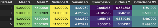
Ok so even though all the other stats were the same the higher moments like Skewness and Kurtosis aren’t. Looking at numbers alone now tells you there is more to investigate.
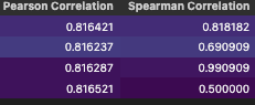
Similarly Pearson and Spearman correlation indicates more investigation is needed. Now it would be hard to justify randomly picking one option is the right thing to do because ‘stats’ actually aren’t the same.
Bonus
Maybe we can add an introductory test like Jarque-Bera to see if the skewness and kurtosis match a normal distribution.
What else? I suppose people love linear regression so we need independence of residuals. We can do a Durbin-Watson test.
We can test for homoscedasticity with a Breusch-Pagan test.
If all these don’t make sense to you then don’t worry just look them up. Once you set up a workflow that tests data before your analysis you can run a bunch of tests easily so while learning is going to feel harder the implementation is easy.
Some of those tests are easier with Statsmodels package.
from statsmodels.stats.diagnostic import het_breuschpagan
from statsmodels.stats.stattools import durbin_watson
from statsmodels.regression.linear_model import OLS
from statsmodels.tools.tools import add_constant
# Create an empty list to store the statistics
stats_data = []

# Iterate over each dataset
for label, dataset in datasets_aq.items():
    # Compute the basic statistics
    mean = dataset.mean()
    variance = dataset.var()
    skew = dataset.skew()
    kurt = dataset.kurtosis()
    correlation, _ = stats.pearsonr(dataset['x'], dataset['y'])
    spearman_corr, _ = stats.spearmanr(dataset['x'], dataset['y'])
    slope, intercept, r_value, _, _ = stats.linregress(dataset['x'], dataset['y'])
    r_squared = r_value**2
    covariance = dataset.cov().iloc[0, 1]

    # Jarque-Bera test for normality on both columns x and y
    jb_test_x = stats.jarque_bera(dataset['x'])
    jb_test_y = stats.jarque_bera(dataset['y'])

    # Prepare dataset for regression diagnostics
    model = OLS(dataset['y'], add_constant(dataset['x'])).fit()
    resid = model.resid

    # Durbin-Watson test for autocorrelation
    dw_test = durbin_watson(resid)

    # Breusch-Pagan test for homoscedasticity
    bp_test = het_breuschpagan(resid, model.model.exog)

    # Append the statistics to the list
    stats_data.append({
        'Dataset': label,
        'Mean X': mean['x'],
        'Mean Y': mean['y'],
        'Variance X': variance['x'],
        'Variance Y': variance['y'],
        'Skewness X': skew['x'],
        'Skewness Y': skew['y'],
        'Kurtosis X': kurt['x'],
        'Kurtosis Y': kurt['y'],
        'Covariance XY': covariance,
        'Pearson Correlation': correlation,
        'Spearman Correlation': spearman_corr,
        'Intercept': intercept,
        'Slope': slope,
        'R^2': r_squared,
        'JB Statistic Y': jb_test_y[0],
        'JB p-value Y': jb_test_y[1],
        'Durbin-Watson': dw_test,
        'BP Statistic': bp_test[0],
        'BP p-value': bp_test[1]
    })

# Convert list to DataFrame
stats_df = pd.DataFrame(stats_data)

# Print the DataFrame
display(stats_df.style.background_gradient(cmap='viridis', axis=1))
Have fun, bye.
Ref
https://matplotlib.org/stable/gallery/specialty_plots/anscombe.html