
Ohaio,
It is interesting to analyse segments created by algorithms. Product managers and marketers will find it a somewhat unbiased way to make sense of customer data. The algorithms can work well but it helps to have a sufficient grasp of statistics and understand the limitations of each model.
I thought it would be useful to write about clustering a retail dataset. We’ll pick a popular machine learning model, not sure which one (it’ll be k-means clustering, probably).
Python for machine learning
I will be using Python. If you haven’t yet learned how to create a new Python environment follow this article:
https://freshprinceofstandarderror.com/ai/setting-up-your-data-science-environment/
Once you’ve set up your environment install the following:
conda install -c anaconda scikit-learn
conda install -c anaconda seaborn
Seaborn is a visualisation library and scikit-learn is a machine learning library. Use Pandas to open the Online Retail II dataset from 2019. It should be installed already since it is a seaborn dependency.
Dataset: https://archive.ics.uci.edu/ml/datasets/Online+Retail+II
import pandas as pd
# https://archive.ics.uci.edu/ml/datasets/Online+Retail+II
df = pd.read_excel('online_retail_II.xlsx')
If there is an error while opening the Excel file try to install xlrd or openpyxl using conda or pip.
conda install -c anaconda xlrd
conda install -c anaconda openpyxl
df.describe()
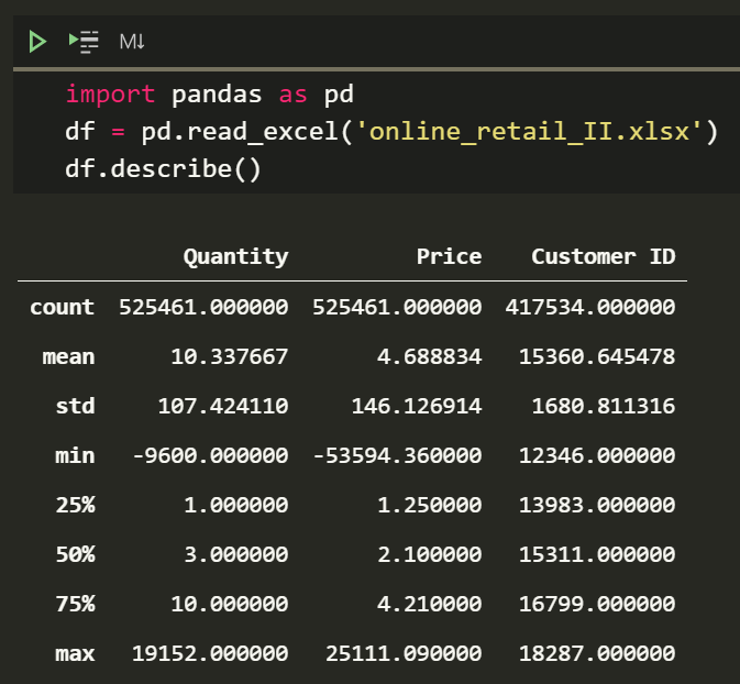
Well, that dataset is half a million rows. Hopefully, you’re not using a potato to run Python.
Examining the dataset
The goal is to cluster users, so examine the dataset with this in mind. Data needs to be of certain type and format to be fed into most algorithms. Ideally numerical data without NaNs.
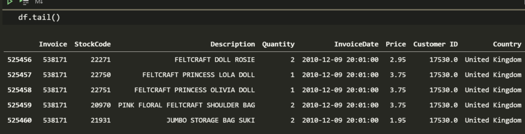
df.tail()
Upon using the describe method earlier we have an idea what some of the numerical columns contain. I was horrified to see they sell something for -53,594 and equally horrified to see they sell something for 25,111 (min and max values for Price).
We can find those outliers for lols.
df[df.Price < 0]
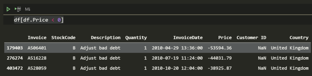
The product they sell for negative amount is called Adjust bad debt.
df[df.Price > 10000]
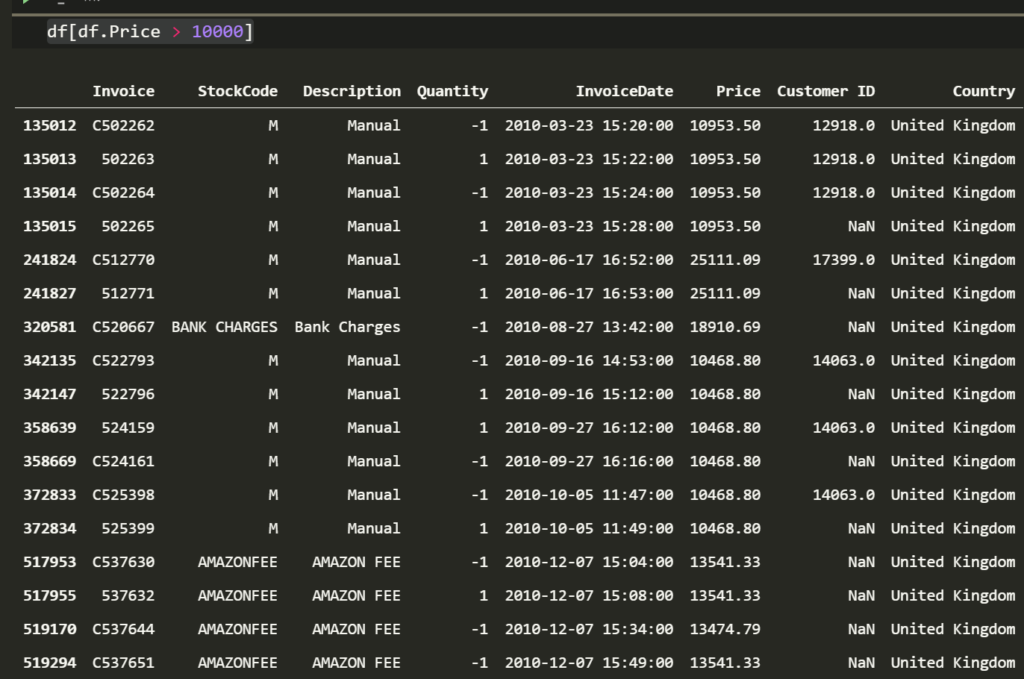
With Amazon fees, bank charges and bad debt in the data set, it might be safer to call them bad values rather than outliers. I promise one day we will produce data without weird values but until then we clean up our datasets.
Cleaning the dataset to use clustering algorithms
Clean the data by picking prices that lie between some range. I use values greater than 0 and less than the .99th percentile for Price. The lower bound could be a percentile too but greater than 0 is a fine assumption. Perhaps the retailer had priced some products close to that value during promotions. Cheap but periodic loss leaders could be another reason those values would be meaningful.
This kind of judgement comes with domain expertise and knowing your company. Feel free to pick another lower bound. I also chose to remove values less than 0 for Customer ID and Quantity.
df = df[df['Price'].between(0,df['Price'].quantile(.99))]
df = df[df['Customer ID'] > 0]
df = df[df['Quantity'] > 0]
df.describe()
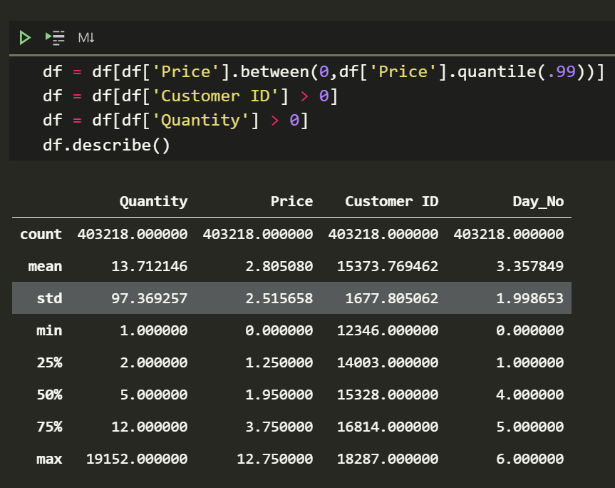
That looks palatable. The data is ready for analysis.
What do I do with the clean data?
Grouping the dataset by the Customer ID will let us create clusters based on their purchase behaviour. However this means we’ll have to aggregate values per user.
For some of the columns such as Price it makes sense to use an average while for the others a frequency count. InvoiceDate is interesting because it requires some thinking. Since that column is a date it can be split into many numeric columns (ew) or turned into a day column.
Sometimes the day people make purchases can provide meaningful information. Your marketing team can provide inspiration for interesting segment names like ‘weekend shopaholics’ or ‘office-hour shopanista’.
The day cannot be used as a string in most algorithms so it must be mapped to a number. Mondays can be 1 etc.
df['Day'] = df['InvoiceDate'].dt.day_name().astype('category')
df['Day_No'] = df['Day'].cat.codes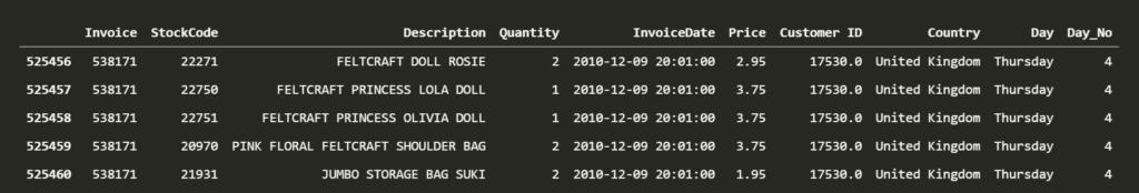
Converting the day to a category type and getting the category code is the simplest way. You’re welcome ?.
Aggregating user data
Now we can group the data by Customer ID. I have created a simple set of rules for aggregation but feel free to create your own.
aggregation_rules = {'Invoice':'count',
                     'Quantity':'median',
                     'Day_No': lambda x : x.value_counts().index[0],
                     'Price':['median','mean']}
The rules are easy to understand, except for Day_No. The mode is a value that appears most often in a distribution. I am using that lambda expression to calculate mode in this instance rather than pd.Series.mode. That expression does not return a list when multiple days have the same frequency count unlike the pandas method.
Price is being aggregated by median and mean so people can see how to aggregate the same column with different functions. The median is a good statistical moment because it is invariant to outliers.
It is time to see the newly aggregated customer data.
kmeans_df = df.groupby('Customer ID').agg(aggregation_rules)
kmeans_df.columns = ['_'.join(col).rstrip('_') for col in kmeans_df.columns.values]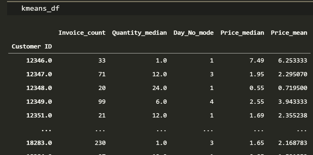
Cool! We have the right data-types in a format that can be used as an input to a clustering algorithm.
The k-means algorithm and unsupervised machine learning

Okay, so there are a few ways to implement the k-means clustering algorithm but this is the simplest and most intuitive.
Pick ‘k’ number of centroids, this is an input and has to be decided by the scientist, it is the number of clusters you want to create. Place those centroids randomly in space with the rest of your data points.
For each data point, measure the squared distance to the centroids. We care about the closest centroid to each data point. Assign each data point to be a part of the closest centroid. All the data points assigned to the same centroid make up that cluster.
Taking an average of a cluster provides the mean (k-mean) ?. Update or ‘move’ the the centroids to these newly calculated mean positions. The term centroid doesn’t make sense unless we relocate them close to the centre of their respective cluster! This step is easy to see in low dimensional visualisations.
Repeat the distance calculation and updating the centroids until the centroids stop moving. This is called letting the model converge. Meaning the loss has settled to an acceptable range and additional training wont improve the model.
This is cool because the model was not provided any labels. This is called unsupervised learning. Algorithms that find patterns in data that are neither labelled nor classified belong in the family of unsupervised learning models. You can label these clusters to your liking.
The process above is called naïve k-means and there are faster alternatives such as those implemented in popular machine learning libraries.
Improving and trying out different k-type algorithms
There are a few ways to pick the number of clusters. The elbow method uses trial and error to plot some error metric of your liking as a function of the number of clusters. The idea is to find the point when additional clusters don’t improve the error significantly. We’ll try it out later.
Initialisation methods include randomly picking points in the dataset to be a centroid. Another popular initialisation method is called random partition, which is assigning each data point to a cluster at the beginning and placing the centroids at the cluster means.
Similarly, there exist many distance calculations. One of the more interesting ones is a multivariate distance calculation called the Mahalanobis distance. In many cases we try to minimise the squared Euclidian distance. Using a different distance metric can be tricky and might need adjustments to the algorithm or the error metric otherwise the model might not converge.
If you understand what an algorithm is doing then it is easier to find solutions for problems as they come.
For those who like concise and mathematical language :
Given a set of observations x1, x2, …, xn, where each observation is a d-dimensional real vector, k-means aims to partition the n observations into k<n sets {S1, S2, …, Sk} with minimal variance within each set.
Thinking about it flexibly like above will allow making necessary adjustments or coming up with your own optimisations when the challenge presents itself.
Practical unsupervised clustering in Python
All of that effort has led us to this point.
from sklearn.cluster import KMeans

analysis_df = kmeans_df.copy()
model_df = kmeans_df.copy()

kmn = model_df.copy()
km = KMeans(n_clusters=3,random_state=420)
km.fit(kmn)
analysis_df['segments'] = km.labels_
We try out the clustering algorithm with 3 clusters, which is the only necessary input.
Lets see how the clusters turned out.
analysis_df.groupby('segments').agg({'Invoice_count':'count','Quantity_median':'mean','Price_mean':'mean'})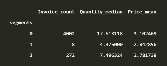
Pretty crap, having one cluster with 4002 users and the rest with so few is unacceptable. This is common when data is of different scales, not only for k-means but a lot of objective functions won’t provide optimal solutions. This requires normalising the data.
Using the z-score ensures that features have a mean of 0 and standard deviation of 1. Min-max scaling is another popular option which keeps the original distribution but transforms the data between some range, for example 0 to 1.
I prefer using z-scores in this case, because our columns are in incomparable units. K-means algorithm also likes clusters that are isotropic in nature and tries to make clusters that look like circles (in 2D). Not normalising the data un-intentionally ends up separating the clusters by features with high variance. We can see that Quantity played a large part in separating the clusters.
Instead of using the standard scaler function in sklearn we can calculate z-scores manually. This way you get to see data de-meaned and divided by the standard deviation. Removing the mean and dividing the result by the standard deviation will result in the 0 mean, 1 standard deviation property.
kmn = model_df.copy()
kmn_df_norm = (kmn - kmn.mean()) / kmn.std()
km_norm = KMeans(n_clusters=3,random_state=1)
km_norm.fit(kmn_df_norm)
analysis_df['segments_norm'] = km_norm.labels_
analysis_df.groupby('segments_norm').agg({'Invoice_count':'count','Quantity_median':'mean','Price_mean':'mean'})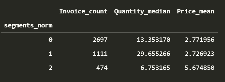
So much better. Understanding the dataset and some statistics makes it easy to make judgements about scaling. Looking it up when in doubt is a normal part (no pun) of the process too.
We have a majority of people in the 0th cluster. People who make double the purchases compared to the majority in the 1st cluster and finally the few people who make few but high value purchases.
We can officially call the clusters something stupid like
average joey
shopnthusiasts and
moneybagels
Elbow method for picking number of clusters
As promised, there may have been a better number to use for the amount of clusters. Ideally we want a small number of pretty different clusters. This idea can be formalised by rephrasing the problem as saying the optimal number of clusters exist right before the point when the error starts to decrease in a linear fashion.
Here goes the famous elbow method, plotting the inertia against the value of K. I got rid of Price_median because I found it redundant.
import seaborn as sns

clusters = range(1, 20)
elbow_map = {}

kmn = kmn.drop(['Price_median'],1).copy()
kmn_df_norm = (kmn - kmn.mean()) / kmn.std()

for k in clusters:
    km_norm = KMeans(n_clusters=k)
    km_norm.fit(kmn_df_norm)
    elbow_map[k] = km_norm.inertia_

sns.lineplot(x=elbow_map.keys(),y=elbow_map.values()).set_title('Elbow plot for optimalish n')
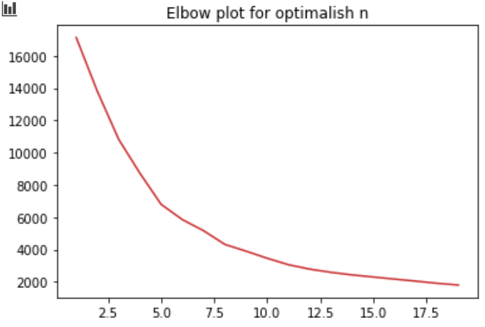
The idea is to pick the number of clusters near the elbow.
Awesome!
What you learned
- Understanding and using the most prolific unsupervised machine learning algorithm.
- Making clusters that segment users based on purchase frequency, purchase amount and purchase quantity.
- Optimising number of clusters in a simple and visual manner.
- Using the median and the mode. Don’t be a n0oBz and use the mean for everything.
What you can learn
- Combining features is useful. We could have multiplied the quantity and price columns to make a ‘customer value’ column.
- Looking at the skew and kurtosis for something like price to understand the clusters better. Even two clusters that spend the same amount on average could have very different price distributions.
- Other clustering algorithms, there are hundreds.
- Making good visualisations to show stakeholders, maybe an article for another time.
References
https://scikit-learn.org/stable/modules/generated/sklearn.cluster.KMeans.html